Project Hub
| Table of Contents | |||||
|---|---|---|---|---|---|
| Ideation Studio | Main Page | Design Studio | Project Hub | Build Studio | Go Live |
Project Hub is the stage where the user can track and monitor the development progress of the BUILD PROJECT. This is also where the collaboration of the team members happens.
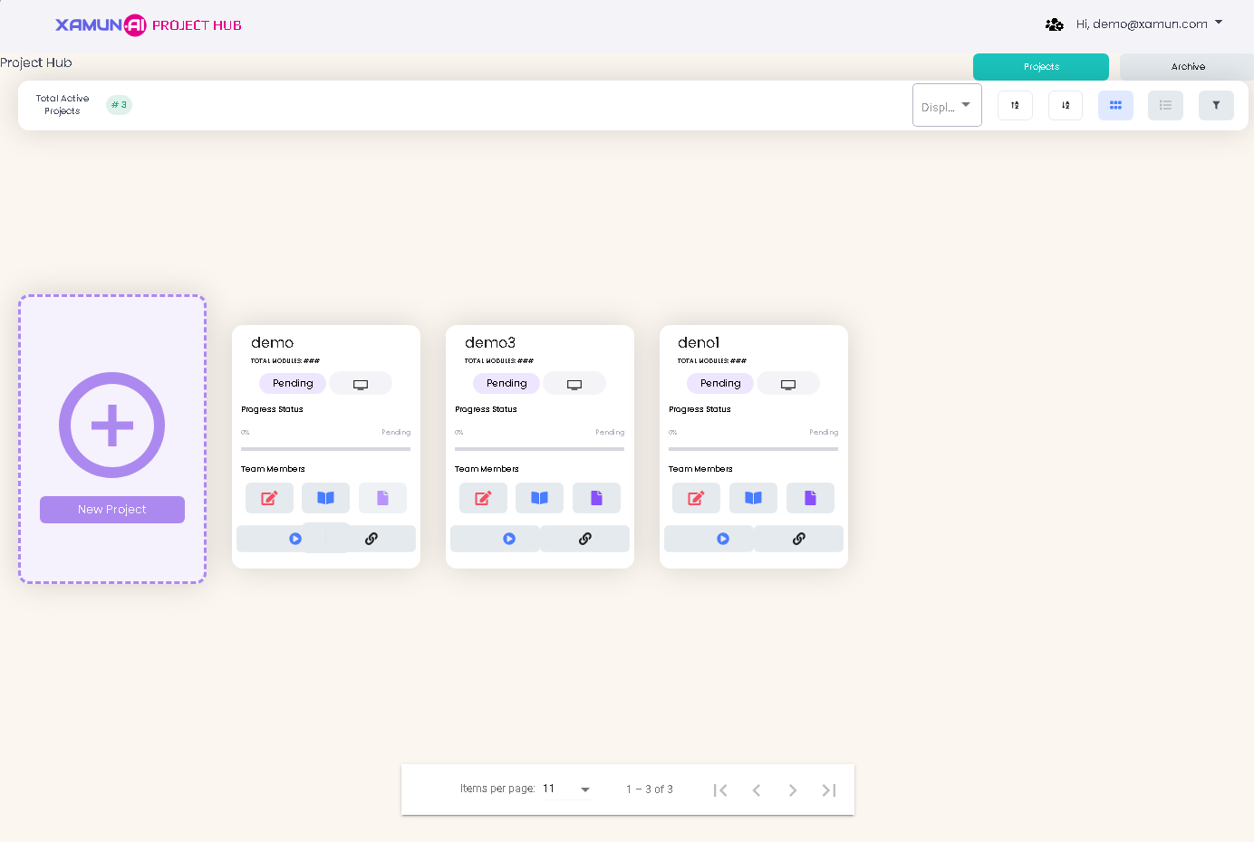
Project Hub Dashboard
After the account has been created from the Design Studio, users will have access to the Project Hub. It has all the projects created with different statuses.
Each project listed contains the Title, Total Modules, Status, Option to Share, Progress Status in % form and List of Team Members. The total number of active projects is shown on this page as well.
| Feature | Description |
|---|---|
| Projects Tab | • If clicked, it will show the projects with different statuses except the archived ones. |
| Archive Tab | • If clicked, it will show the projects set to archived. |
| Active Tab | • If Tile type is selected, it should show the projects in card view. • If List type is selected, it should show the projects in list view. |
| Filter | • List of statuses. • Filtered projects must be shown based on the selected status. |
| Project Card | • If clicked, it will show the PROJECT MILESTONE AND GENERAL UPDATES popup. |
| Edit Project (Red Icon) | • If clicked, it will redirect to Design Studio and Customize Modules step. |
| Collaborate With Xamun Team (Blue Book Icon) | • Schedule a meeting with our team if you want to collaborate with us directly. |
| Request Proposal (Purple Note Icon) | • If clicked, it will open the PAYMENT TERM popup. |
| Request Sent (Green Note Icon) | • Serve as indicator that your PROPOSAL is SENT. |
| Play Icon (Blue Icon) | • If clicked, it will play the uploaded video recording. |
| Link Icon (Black Icon) | • If clicked, it will redirect to the Figma prototype. |


| Feature | Description |
|---|---|
| Working with Figma | • If clicked, you can choose EXPORT SOLUTION, IMPORT SOLUTION, and MEDIA LIBRARY. |
| Number of Module Pages | • Number of pages available from Xamun Library vs to be designed pages suggested by AI. |
| Add (+) button | • Found on the upper left corner of the Module list. • If clicked, it will show a popup to choose beTween ADD NEW MODULE FROM LIBRARY or ADD BLANK MODULE page. |
| Arrow Up/Down Icon beside the module | • If arrow up is clicked, it will list down all the pages of the selected module. • If arrow down is clicked, it will hide all the pages of the selected module. |
| Module Setting (Gear Icon) | • If clicked, it will show the two kinds of adding the page, namely: Add page from library, Add blank page. |
| Clickable Page Name | • If clicked, it will display the page preview. |
| Switch / Toggle Button | • Found on the left side of the page name. • If clicked, it will Toggle button to remove or add page. |
| Right Arrow beside the page name | • If clicked, it will show DESIGN PREVIEW page. |
| Available Modules/Pages | • If clicked, it will display more modules and pages. |
| Proceed | • If clicked and validations passed, it will redirect to the next step. • If validations fail, an error message must be displayed. |
| Menu Icon | • Found on the most upper right corner of the page beside PROCEED button. • If clicked, it will show the SOLUTION INFORMATION page. |
| Web/Mobile Toggle | • If web toggle is clicked, it will show the web view. • If mobile toggle is clicked, it will show the mobile view. |
| Arrow Navigator (left and right) | • It will be shown if the selected module has multiple pages. • If left arrow is clicked, it will navigate to the next page. • If right arrow is clicked, it will navigate to the previous page. |
| Write Note | • If clicked, it will open the Note popup page. |
| Edit Note | • If clicked, it will open the Note popup page with the previously saved information. |
| Add Page from library | • If clicked, it will redirect to ADD PAGE. • See PERSONALIZE MODULE section > ADD PAGE VIEW for more details. • Inside Gear Icon (Module Settings). |
| Add blank page | • If clicked, the screen will show a blank page. • Inside Gear Icon (Module Settings). |
Edit Page Functions
| Feature | Description |
|---|---|
| Other Specs | • You can edit or add functional details to the page you're working on, including third-party APIs, logic, and computations. |
| Apply changes | • If clicked, it will apply all the changes made, if there are any, and redirect to the FINALIZE step. • If clicked and nothing was updated, no changes must be saved and will redirect to the FINALIZE step. |
Build Studio Dashboard
This is the page where the Developer can start the development.

| Table of Contents | |||||
|---|---|---|---|---|---|
| Ideation Studio | Main Page | Design Studio | Project Hub | Build Studio | Go Live |